


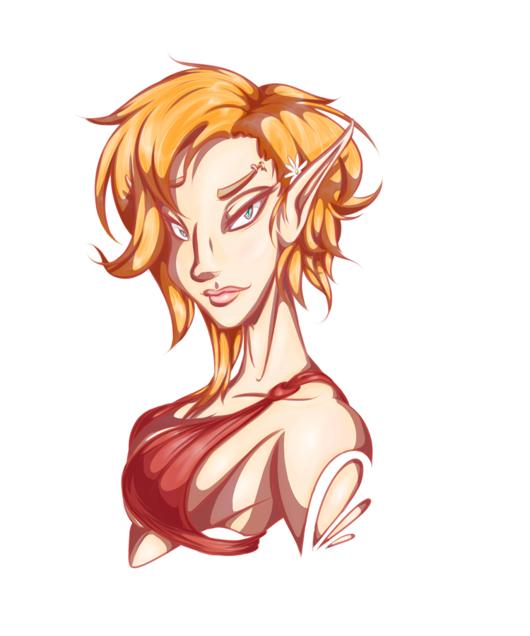
So I just finished a (utterly oversimplified) piece for my current avatar at RecolorMe and came across a bit of a toss up for styling. The first more a deep charcoal gray, the other is darker but soft red lines and I really can't decide which I like better. Could really use an outside/objective opinon.
edit: ew.....why is it all yellow/white in the back? They both have clear backers....and why the hell doesn't it show up in the preview.

ReNaeNae
I like the top one better. The contrast makes it pop more, imo. Either way... lovely work! :D
(I don't see any yellow backgrounds.)
MeMyselfAndEyes
Many thanks!
[ Interesting, on mine (outside the preview) it shows a bright super saturated yellow when not hovered over and white when you do hover over the images. Glad to hear that it's not doing that for anyone else though, it really ruins the colors that are there. ]